

class="inspire-body-text">In this brief tutorial, digital designer and entrepreneur Sarah Jane Parmenter walks us through a new feature of Adobe XD CC: the Responsive Resize feature, which allows you to resize groups of objects while maintaining those objects’ relative placement and scale—very handy when you’re designing across multiple types of devices. Watch the video below to see how it’s done (Parmenter’s steps are also written out below the video). Then try it for yourself—download Adobe XD for free to get started.
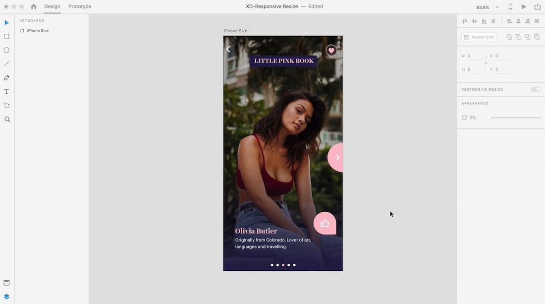
• I started with a iPhone-size canvas, which I am going to resize for an iPad.
• I grouped elements—this tells XD that there is a spatial relationship between them. Select elements and press command-G to group them, so that those elements will be scaled proportionally.
• Sometimes you may want to tell XD how to deal with individual elements. You can do that by making selections in the Responsive Resize section of the right-side panel. In this case, I do not want to automatically scale two text elements. I selected each element, chose manual (instead of auto), deselected fixed width and fixed height, and removed anchors, so that XD can base each text element’s new size on a percentage of the entire canvas.
• With the canvas selected, I then turned on Responsive Resize in the right-side panel, duplicated the canvas, and adjusted the duplicate to a new size: 1024 x 768 (the size of an iPad screen).
• XD then auto-scaled the original canvas, retaining my design.
• I finished up by making some small adjustments—for instance, changing font sizes and giving the like button more space—but this was not because XD had “guessed wrong”; rather, I simply wanted to make some minor alterations for the larger canvas.
October 29, 2018


