The Jacques-Ouellette School (l'école Jacques-Ouellette) in Longueuil, Quebec, Canada, provides preschool, elementary, and secondary education for blind and visually impaired children and young adults. The school’s foundation—la Fondation de l'école Jacques-Ouellette—is responsible for acquiring the financial resources that support the school’s projects. When the foundation’s directors wanted to re-imagine its visual identity, they turned to two designers: Simon Langlois and Raphaëlle Brillant.
THREE MARKS IN ONE
In addition to supporting the school, the foundation supports the library associated with the school—the only library in Quebec that has a complete selection of books adapted for visually impaired readers. The notion of this library was central to the three-pillared mark that Langlois and Brillant developed.

The project’s animations—which were all created in Adobe After Effects—add to the brand’s dynamism and youthfulness. (Learn more about the basics of keyframe animation in After Effects, in this tutorial, which provides practice files.)
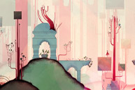
Langlois describes the mark’s three pillars as representing knowledge, language, and success: “Books are the indispensable tools for the school’s students, and they represent the library that the foundation seeks to enrich. Language is represented by a hand, as braille is read with the hands—this aspect of the visual identity communicates that the foundation serves people who are blind or visually impaired. Then there are the steps that lead to success, because the foundation provides the school’s students with resources that allow them to flourish.”
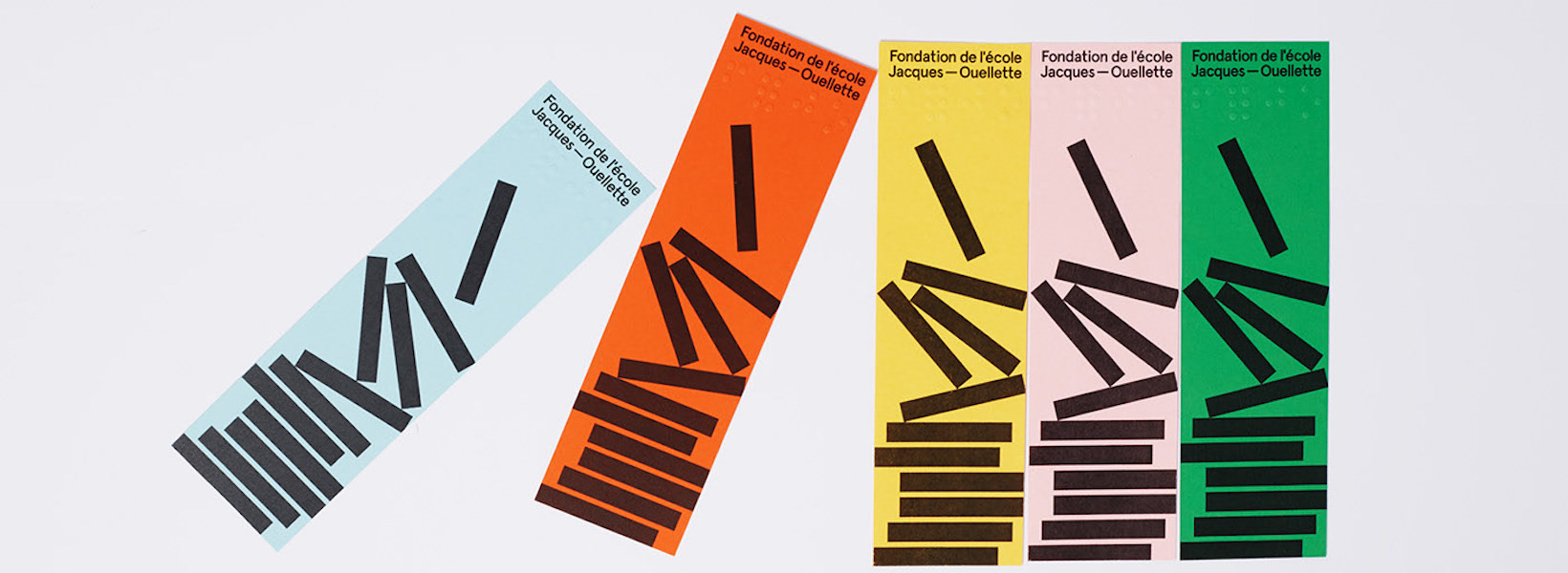
Keeping in mind that many people who viewed their design would have visual impairments, Langlois and Brillant created simple, bold shapes, paired with a sturdy sans-serif typeface. And the color palette was chosen with similar concerns in mind.
Brillant says, “We had to think in terms of the inclusion of visually impaired people. So we chose to put black text and symbols on lightly colored backgrounds, allowing high contrast and easy legibility…. The symbols and text are always in black on a single color. We did not want to combine colors, because we were worried that this would affect legibility…. At the same time, we also didn’t want to limit ourselves by reducing the number of colors, since the Jacques-Ouellette School Foundation serves young people. The colors provide a lighter and more joyful feeling.”
The result is an identity that is broadly appealing—important for a fundraising organization that casts a wide net for donors.
ADDING ANIMATIONS
Animations were not part of the brief that the designers received; however, the pair felt that in an age when so much happens online, animated elements should be an essential part of the branding. Langlois explains, “We love working with animation because it allows us to add layers of information. Through the animation, the brand’s three pillars make an infinite loop. With the bouncing ball that allows the transformation of one symbol to another, we wanted to represent the foundation and how it causes a positive change in the lives of its students.”

In addition to using Adobe After Effects to create the animations, Langlois and Brillant say that Creative Cloud apps are “the tools that materialize our ideas.” Adobe InDesign, Illustrator, and Photoshop were used to create the visual identity. Lightroom was used to manage the project’s images. And it was Behance that allowed the designers to “share and interact with the design community all over the world.”
MAKING AN IMPACT

See more of this project on Behance.
The designers found this project—helping an important cause better represent itself to potential donors—to be especially meaningful. Brillant says, “It’s not every day that we can do design that will directly impact the lives of many people. Design always has an important communication function, but it’s while working on projects like this that we can truly realize the impact that it can have and its importance.”